Research
Design
Prototype
10 Weeks
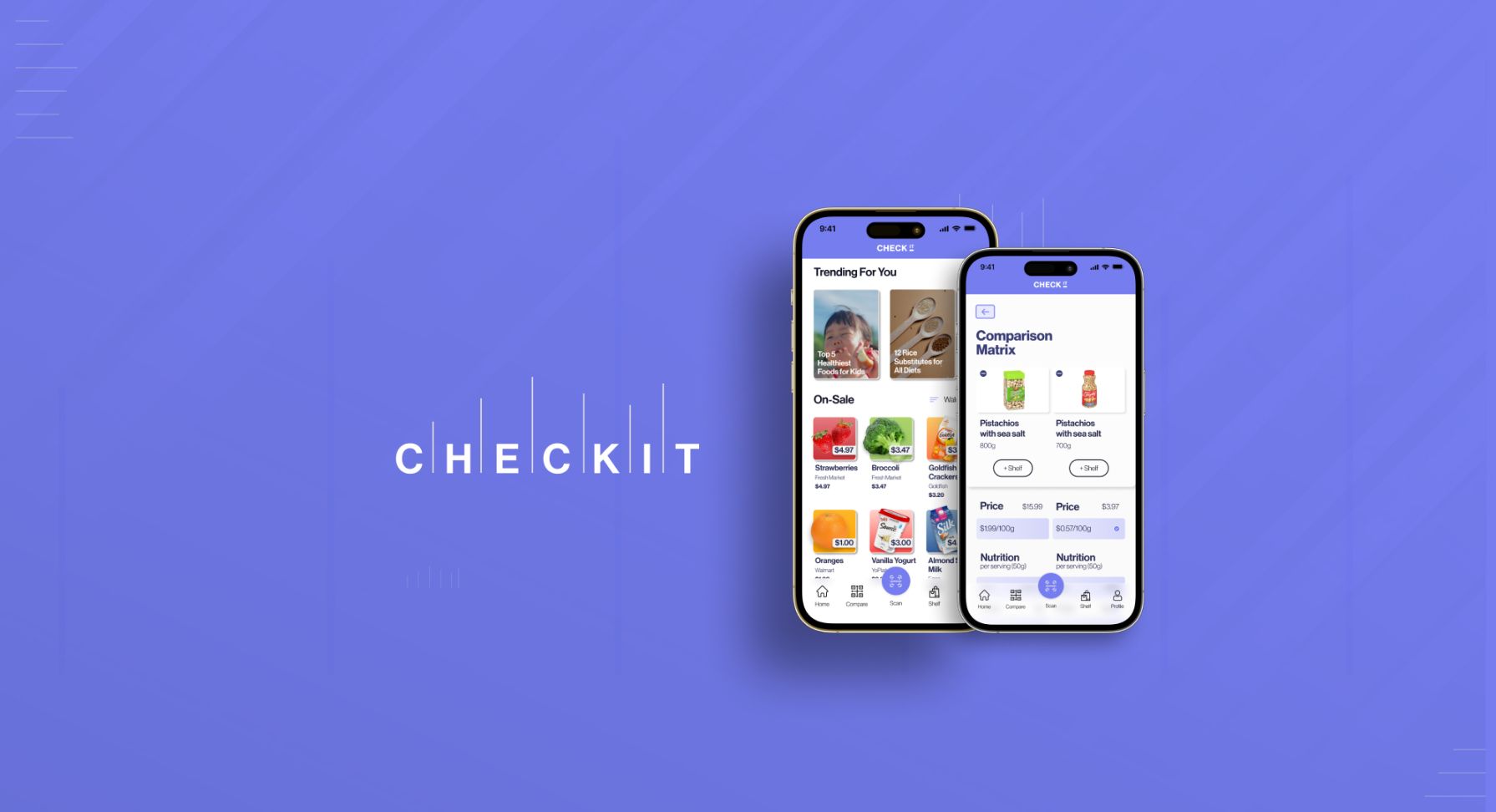
Driven by the challenge of making grocery shopping simpler and more informative, I developed an app that enables users to scan barcodes and instantly access detailed information about product ingredients, nutrition, and pricing. This project, rooted in extensive research and user-centered design, transforms the shopping experience into an informed, efficient, and budget-friendly journey.
Research has shown that grocery shoppers suffer from information overload when confronted with too many options in store. This results in a lack of consumer confidence and poor decision-making, ultimately leading to buyer's remorse (Source: International Business Research).
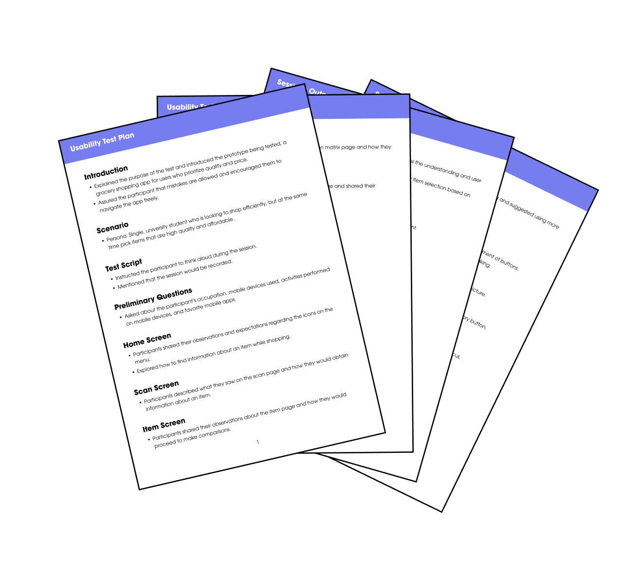
To gain firsthand insights into the issue of information overload among grocery shoppers I conducted five interviews, each lasting 30 minutes, with individuals aged 22-60 who shopped at least twice weekly. This process was to test my initial assumptions about information overload in retail settings and to delve deeper into shoppers' feelings, thoughts, and behaviors.
After conducting the interviews, I reviewed the transcripts, drawing together major themes into visual groupings. This process transformed scattered data into meaningful connections, providing me with an understanding of the motivations behind user behaviours in the store.
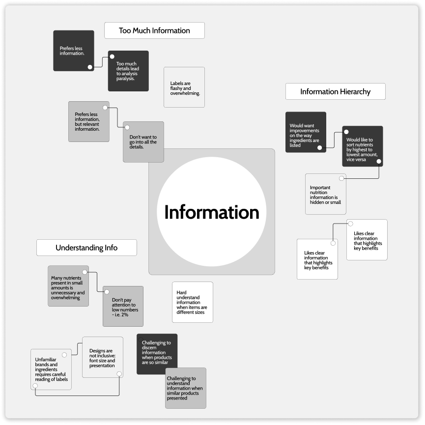
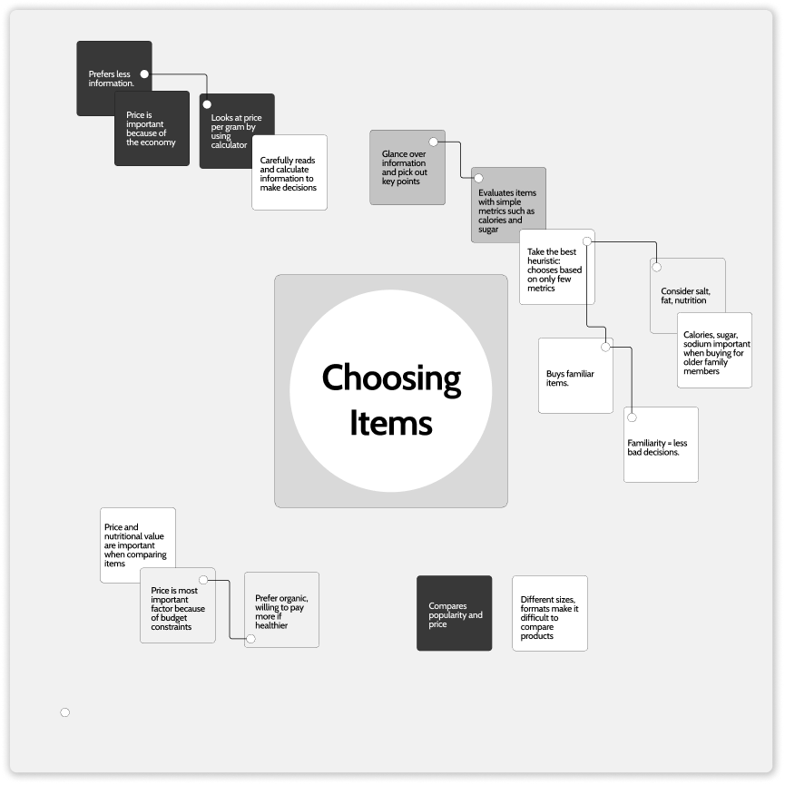
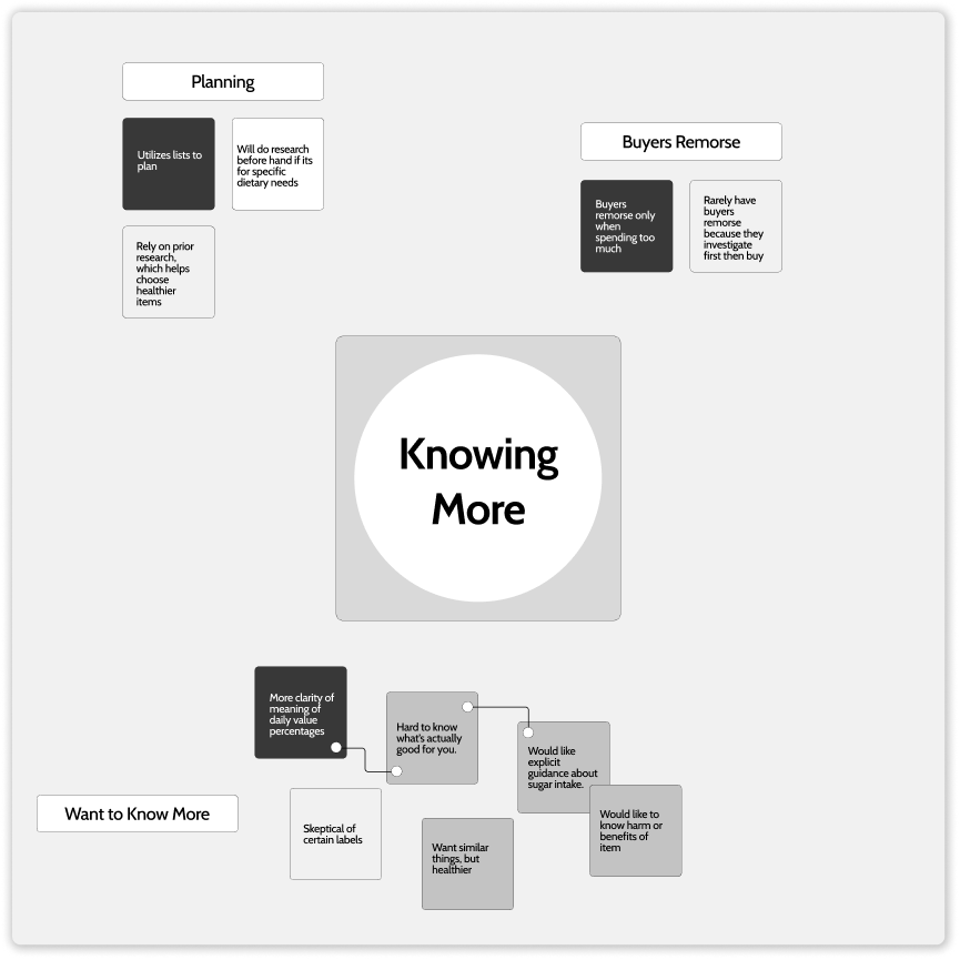
Through in-depth interviews, my understanding of user preferences in packaging information evolved. Initially, I believed that minimal information was universally preferable, but I learned that this view was too simplistic. Diverse user personas emerged, revealing that while some favor minimalism, a significant segment values detailed, relevant information.
How might we provide shoppers with a deeper understanding of what they are buying without confusing them with too much information?

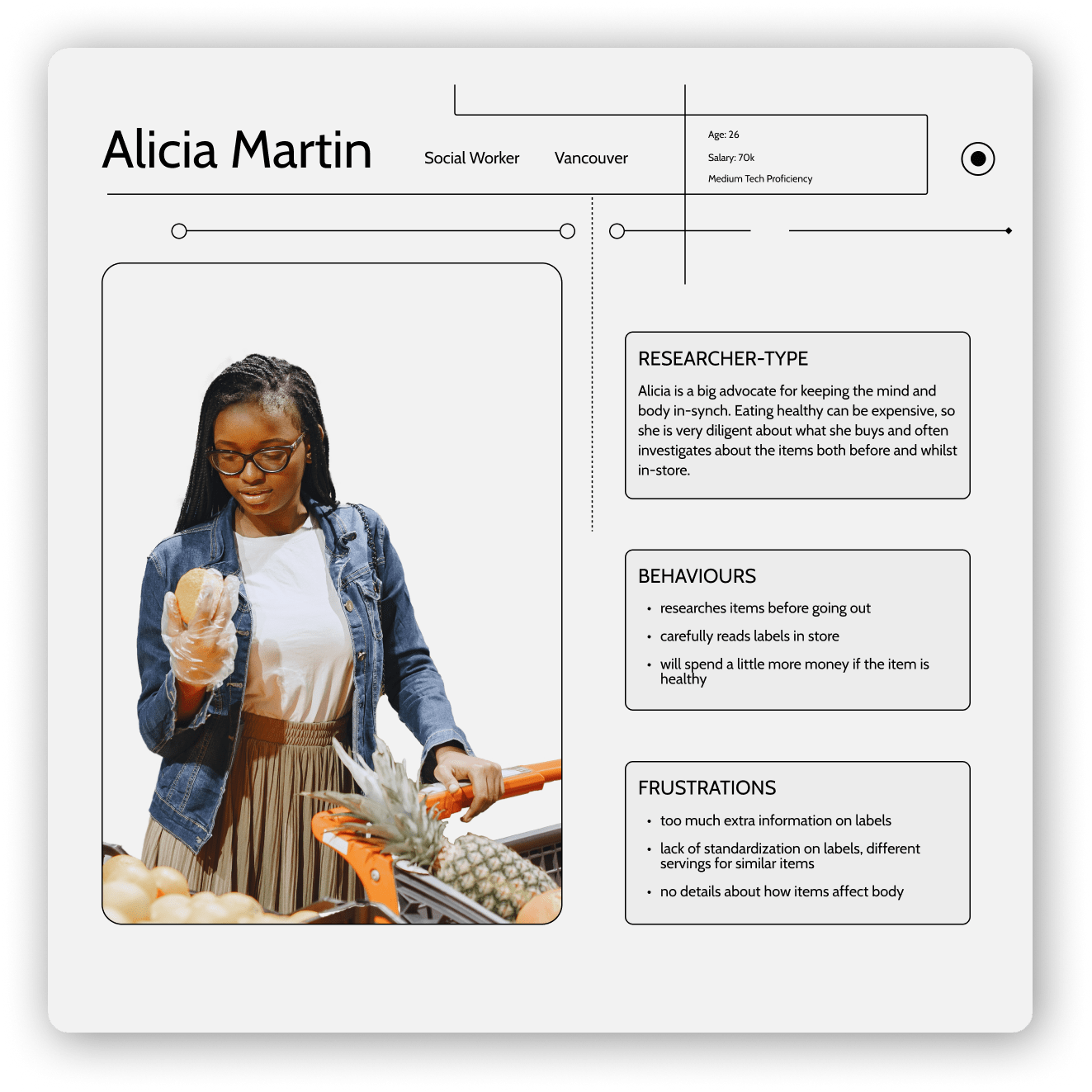
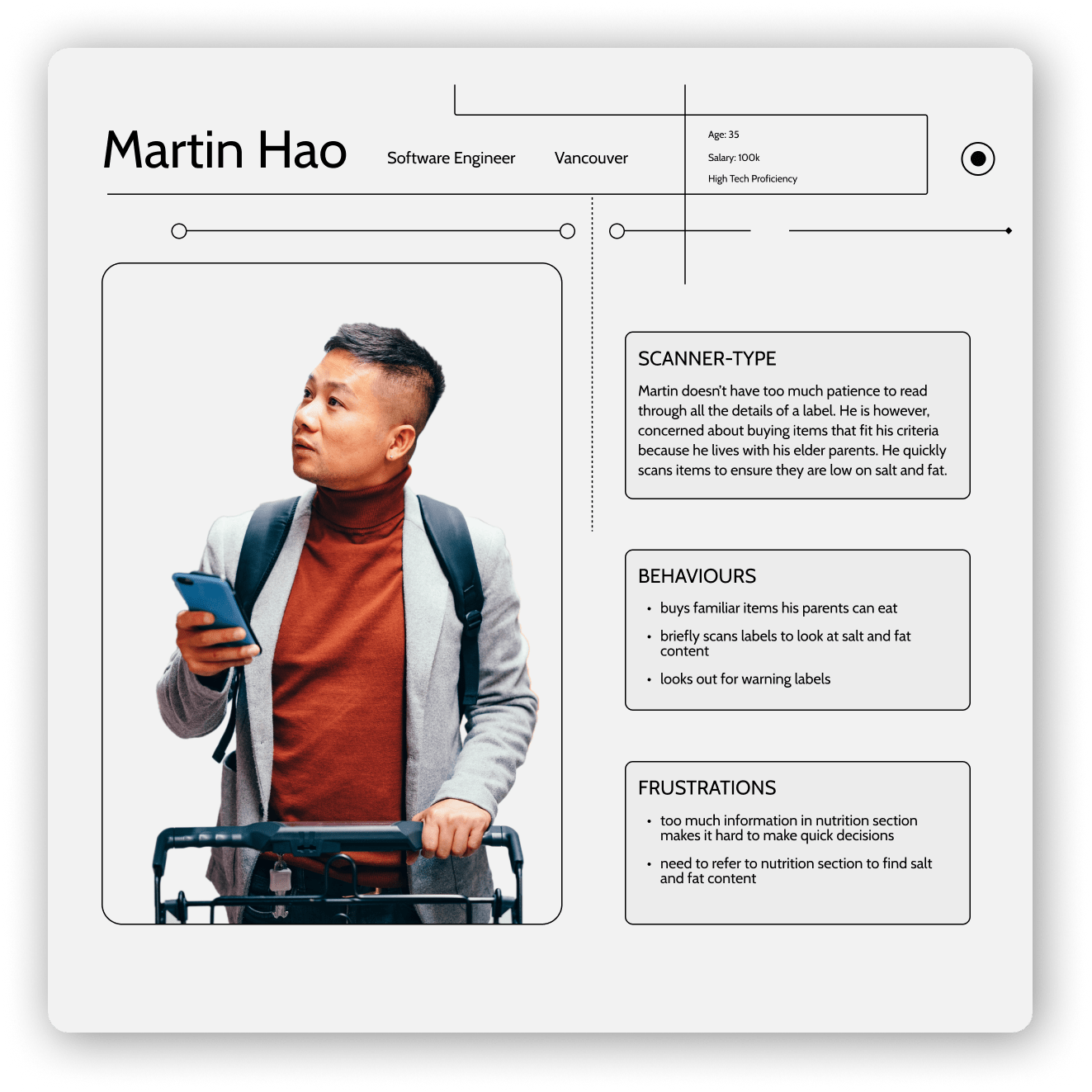
In analyzing interview data, two key personas emerged to guide the CheckIt app's design. Alicia Martin is a Researcher-Type, seeking detailed product information. The second persona, Martin Hao, is a Scanner-Type, needing quick health insights for family diets. Their distinct needs informed features for both comprehensive analysis and rapid information access.
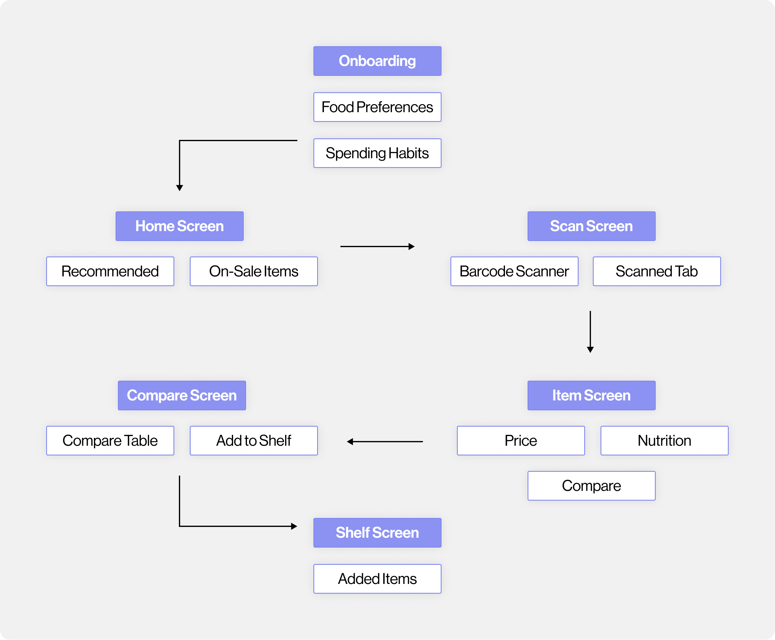
Starting from the home screen, users like Alicia can select items for detailed comparison, and Martin to rapidly scan for nutritional content. After scanning items, users are directed to information screens, with the option to compare nutritional data on a matrix—a feature that aids Alicia in making informed decisions. Martin benefits from the efficient layout.
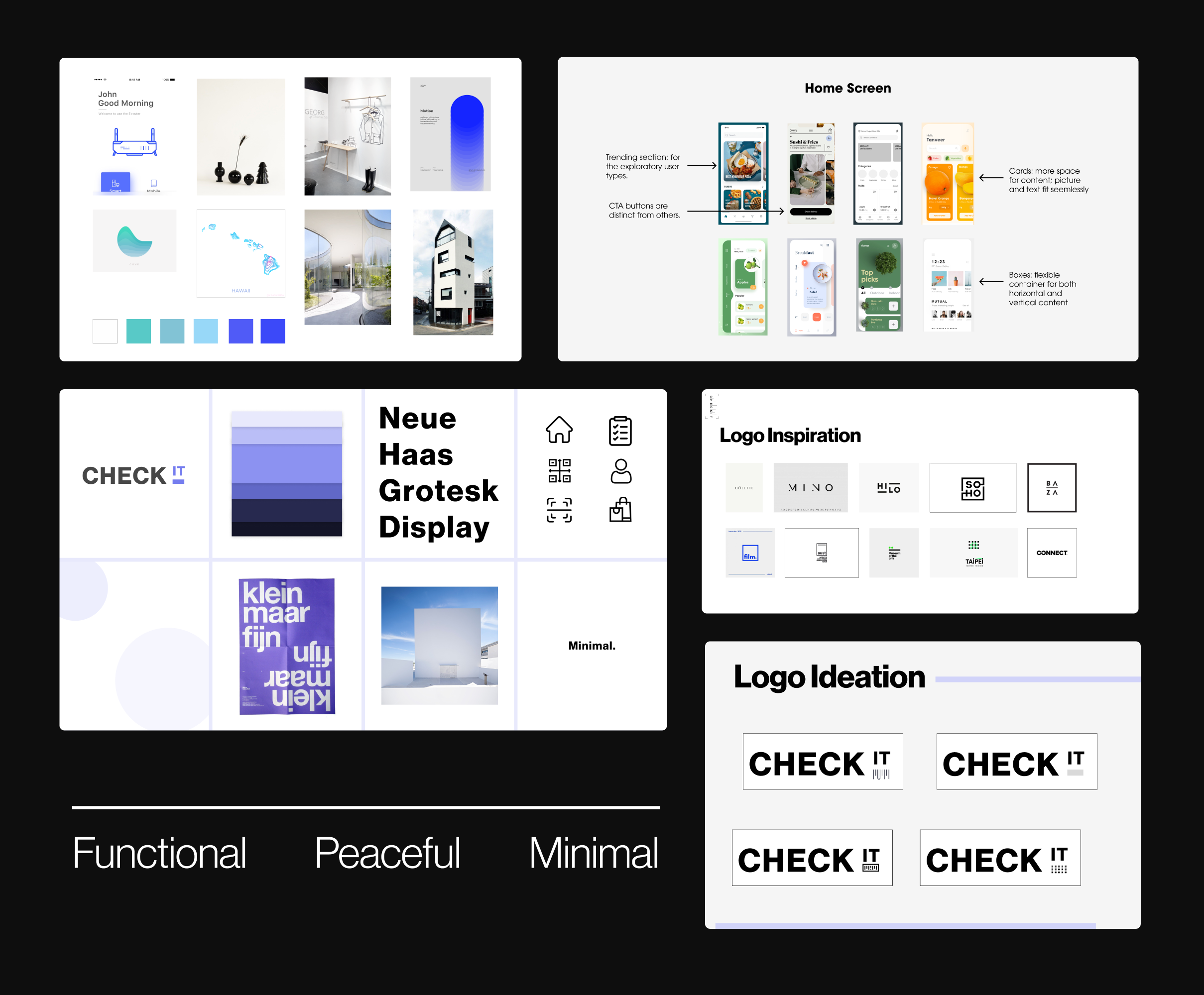
The CheckIt app's ideation board is a study in minimalism and functionality, showcasing a selection of modern typefaces and a serene color palette. Logo designs were distilled from minimalist inspirations, culminating in a clear, user-friendly brand identity that aligns with the app’s aim to provide a streamlined shopping experience.
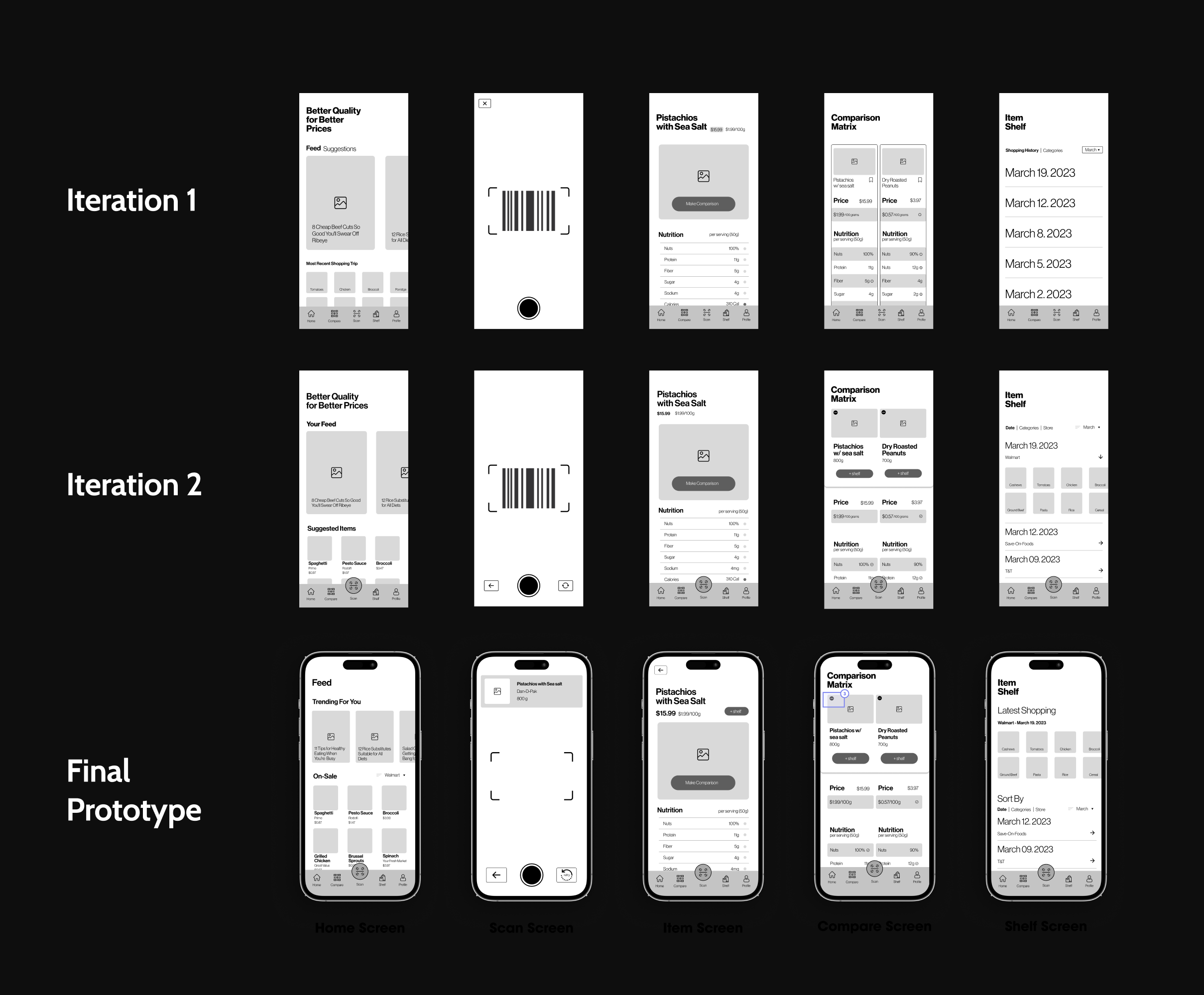
Three iterations of the CheckIt prototype were crafted, with each undergoing testing by five participants to assess its viability and usability. While the core task remained consistent, significant refinements were made in presenting information on the item and comparison screens , aiming to enhance accessibility and ease of use.
The usability tests for the Smart Compare App indicated key areas for improvement: home screen personalization, scan screen's comparison process clearer, emphasizing nutritional and price information on the item screen, improving visibility of buttons and text on the comparison screen, and showcasing current and past items more effectively on the shelf screen. These changes aim to improve personalization, clarity, and user navigation, thereby enhancing the overall shopping experience.
By understanding preferences, CheckIt can tailor suggestions and give warnings of items that are not suitable to the shopper.
Minimizes time searching for products by suggesting relevant items based on previously saved goods, dietary preferences, and spending habits.
Simply scan an item's barcode to unlock a world of information: ingredients, nutrition, and pricing.
Gives insights into how each item fits into the dietary preferences and budget constraints of the shopper.
Side-by-side comparisons allow for weighing of options based on nutritional value, price, and dietary alignment.
The User Centered Design process is a circle of discovering, designing, and delivering.
In the discovery phase, I focused on understanding user needs and the market context. This involved immersing myself in the users' environment and identifying their daily challenges.
In the designing phase, my approach was guided by user feedback. Constant refinement of ideas, prototypes, and features was key, ensuring alignment with real user experiences and inputs.
The delivery phase was about launching a product that met user needs and enhanced grocery shopping convenience. It was crucial that the final product effectively addressed the challenges identified and improved the shopping experience